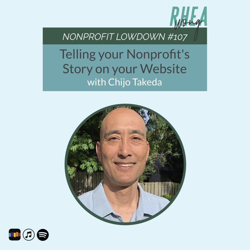
Full confession: my personal pet peeve = clunky, TMI nonprofit websites. Everyone trying to tell their whole life story complete with annoying pop-ups asking for my email, bad photography and hard-to-read fonts are just NO BUENOS. Websites are like dating profiles–providing just enough to invite engagement. Join me and website expert Chijo Takeda as we talk about ways to improve nonprofit websites. We also do some website critiques (with lots of love and respect!). Chijo drops some major value bombs that will help you to improve your website right away! Pro tip: try winnowing your site down to one page. Mind blown!
For more about Chijo: https://dogpawstudio.com/
If you want to follow along on the website critiques:


